The Infographic
Imagine that you have worked with your team to create a masterpiece of an app. The user interface is beautiful. Then you have the user interface translated into German. When you open up the German version of the app, the design looks terrible. Many words are cut off in the middle, and elements look the wrong size. Why?
Different languages take up different amounts of space. The varying line lengths between the different translations can wreak havoc on your beautiful design.
The same content in one language can be too long in another language. This is quite common when translating Chinese apps into English or English apps into German. In the infographic below, you will see how the same text in different languages take up different amounts of space.
To create this infographic, we compared translations of the UN’s Universal Human Rights text, which is available in over 500 languages. We pasted the text into a Word document and counted the lines of text for each language.
(Note: Click on the infographic to see the language line lengths compared.)
Created using Visme. An easy-to-use Infographic Maker.
User Interface Designed for Localization
In the infographic you can see how various languages take up widely varying amounts of space. Translation can have a huge effect on the user interface of an app. An app that looks great in one language looks completely off in another.
If app developers disregard this principle, they will have to custom-design apps for each individual language that the apps are released in, leading to an exponentially increasing workload.
Not fun.
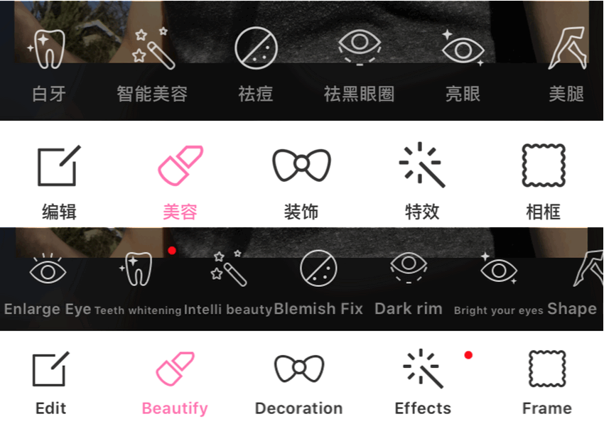
Below is an example of an app with this problem. The app in the following images, Photo Wonder, was developed originally in Chinese. Its designers counted on each text string taking up only the space of four or fewer Chinese characters. But when translating the app to English, they needed to shrink or enlarge the font of each label in order to get it to fit in the interface. This led to a messy appearance on the English version.
(The dark and light bars on the top of the image are the toolbars in the Chinese version of the app. The dark and light bars on the bottom of the image are the same toolbars in English.)

App User Interface Line Length in Chinese and English
That’s why if app developers plan to market apps in multiple languages, they must count on the length of the text changing from one language to another.
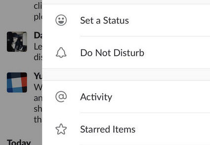
One reliable way to accommodate variable line length is to arrange options vertically so that there is plenty of space for the words to extend to whatever length is necessary, such as in the Slack app screenshot below.

Easily Localizable UI Layout for International Apps
That means that the best time to think about localizing your app for other languages is before you even start to design the app for English. Design it to accommodate other languages in the first place, and save yourself plenty of grief later on.
Other Tips for App Localization
Beyond just laying out the app design so that text can contract or expand, there are also other things to keep in mind when translating an app. The translation industry uses the word “localization” to refer to not only translating the text of an piece of software but also adapting all elements of the software to the target user group.
Prototypr suggests some of the following design principles for effective localization into other languages:
-
- Maintain plenty of blank space in the design.
- Design so that page elements or text can wrap to the next line.
- Be aware of what elements need reversing and which don’t for languages written from right to left (RTL) such as Hebrew and Arabic.
- Conduct usability and interface tests with a translator or native speaker of the language.
- Design according to the country where the app will be used, remembering differences in areas such as currency and measurement systems as well as time and number formats.
- Allow the user to change the date format if this is applicable.
- Design to accommodate different name orders such as for countries like China in which the family name comes first and the given name goes last.
- Code that concatenates strings with variables may also need changing to adapt to other languages such as Japanese that uses completely different word orders.
- Overlay text over images rather than making the text part of the image. In this way, the text can be translated easily without redoing the image.
- Be aware of icons that do not communicate the same message in other countries, for example, an envelope is universal, but the American style mailbox may confuse people from other countries who have different styles of mailboxes.
As you can see, app localization is more than simply translating a few words. It must be viewed as a strategy and a set of best practices with the end goal of not only the efficient use of your time but also usability for the end user no matter what language.
Here at Ivannovation, we are uniquely qualified to help you with your software localization project from early stage consulting to full localization regardless of whether it is an iPhone or Android app.
Article and Infographic by Gisel Olivares and Darren Jansen
Gisel Olivares, Content Editor + Creator + Curator at her online business, GeeOlives. GeeOlives provides social media management, copywriting and editing, web customization and development, and graphic design, among other related services to small businesses, nonprofits, and sustainable brands. I have a love for languages, traveling, social media, and writing. I am fluent in English and Spanish, and still working on perfecting my French while living in France for almost three years.
Darren Jansen, business development and content manager for IVANNOVATION, has a lifetime love for tech and languages. At IVANNOVATION he helps software developers get professional localization for their apps, software, and websites. On his time away from the office, he can be found hiking the Carolina wilderness or reading Chinese literature.


![Varying Line Lengths of Different Languages vs User Interface [Infographic]](https://ivannovation.com/wp-content/uploads/2017/08/hello-1502369_1280.png)
